Tracking project progress effectively is paramount. Burndown and burnup charts are simple but powerful tools in project management. They provide visual representations of project progress, helping team and stakeholders monitor remaining and completed work. These tools facilitate better decision-making, timely adjustments, and clear communication across all levels of an organization.
Although commonly associated with agile project management, burndown and burnup charts are equally applicable in hybrid and traditional (waterfall) approaches. Their versatility makes them invaluable for status meetings, progress reviews, and performance tracking across different project methodologies.
Data visualization burndown/burnup charts have been labeled “low tech and high touch” tools since they can be easily plotted on an excel spreadsheet and have a powerful reach enabling timely information sharing to the rest of the organization. When complex data gets organized into a visual format, it becomes accessible and much easier to interpret. Burndown/burnup charts can be easily updated on a weekly basis and can help teams absorb information quickly and make informed decisions that are vital in fast-moving project environments.
These visual artifacts aren’t just about keeping track of tasks. They actively support more strategic decision-making and prioritization. By presenting data graphically, they aid managers and teams in steering the project effectively, ensuring that resources and efforts are directed where they’re needed most.
Understanding the differences between burndown and burnup charts can be crucial. Burndown charts focus on what’s yet to be completed, while burnup charts show the progress made over time. Each has its use; combining them offers a full perspective, which is incredibly valuable for both team members and stakeholders, fostering better communication and transparency across the board.
The Burndown Charts
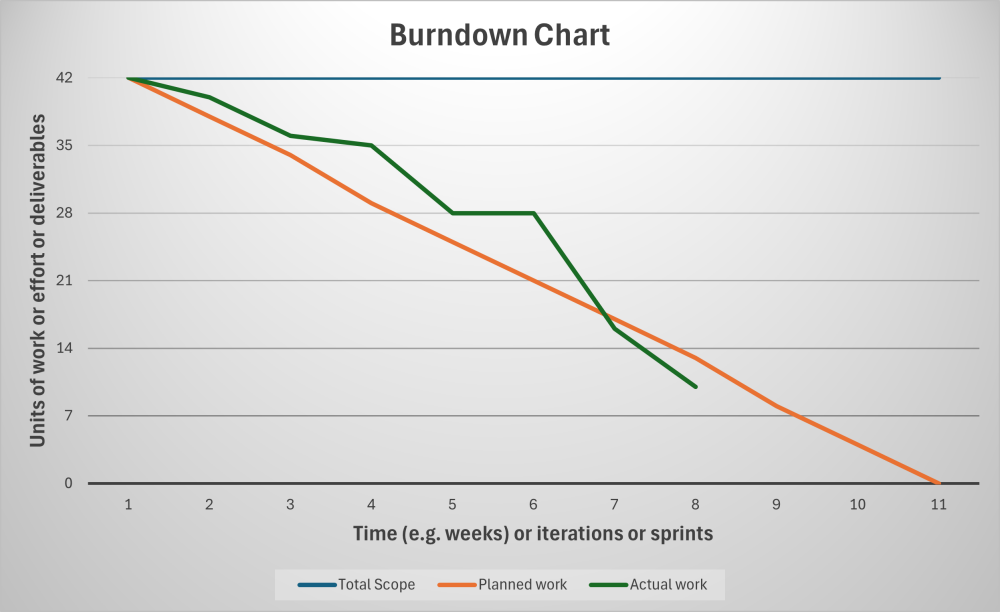
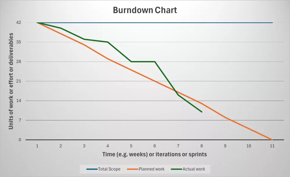
Burndown charts stand out for their simplicity and clarity, offering a straightforward line graph that tracks the remaining work in a project over time. They provide an instant snapshot of the project’s status, making it easier for teams and managers to spot any deviations from the plan.
These charts are particularly useful for monitoring the team’s pace and making necessary adjustments to stay on track through monitoring progress against planned completion and highlighting deviations from expected performance, prompting timely interventions. They are used as well to identify trends, like potential delays.
The chart typically plots work remaining i.e. ‘story points’ or other units of work, activities, tasks, or deliverables on the vertical axis (Y-axis), against time (like days/weeks/months) or iterations on the horizontal (X-axis). As work progresses, the line on the graph ‘burns down’ towards zero, ideally reaching it by the project pr phase deadline. This is visually represented as a downward slope of the actual work compared to the planned work. Deviations highlight issues enabling timely course corrections. Even in waterfall (predictive) project life cycles and/or development life cycles, burndown charts can track progress against milestones or deliverables, offering a clear visual for project status meetings.

A key benefit of burndown charts is their ability to facilitate immediate insight into project flow. They pave the way for honest discussions about what can realistically be accomplished, enabling teams to adjust workloads if necessary or to pinpoint areas that need more focus. This isn’t just about micromanaging but about empowering team members with actionable data.
Yet, these charts come with challenges. A significant flat line could indicate performance issues or unexpected scope changes or impediments. At the same time, scope creep might not be immediately visible, creating false confidence about project progress. Understanding these nuances allows for more effective use of burndown charts. Recognizing their limits means you can take proactive steps in managing your projects effectively, whether by incorporating additional charts or adjusting the project’s scope based on real-time feedback.
The Burnup Charts
Burnup charts bring their unique advantages to the table by showcasing what a project team has accomplished over time. Unlike burndown charts, they emphasize progress made rather than just tasks left to complete. This approach shifts the focus towards achievements, which can be a morale booster for teams by highlighting their hard-fought battles.
In a burnup chart, the horizontal axis displays time or iterations, while the vertical axis presents the scope of work to complete like the burndown charts X-axis and Y-axis. An upward trend in the chart shows how much work has been completed against the project’s original goals. This visual representation helps teams understand their real-time progress toward the overall project scope, offering clarity that can sometimes be missed in other formats.
Burnup charts are excellent at visually depicting scope changes. When new tasks are added or removed, the chart reflects these variations, providing a clear insight into how the project scope has evolved. This is particularly beneficial for projects with flexible or frequently changing requirements, helping teams manage expectations and communicate changes effectively to stakeholders.
Combined Burn Charts
Using burnup charts in tandem with burndown charts can give a more complete picture of project status. While the burndown chart highlights the work yet to be done, the burnup chart showcases achieved milestones, allowing for a nuanced examination of what’s been completed and what’s still on the horizon. This dual approach facilitates better decision-making and resource allocation.
By leveraging both types of burn charts, project managers can more easily forecast and make informed decisions about their project’s trajectory, improving team productivity and ensuring that all parties involved have a transparent view of the progress being made.
Enhancing Project Management with Visual Controls
Visual controls are powerful tools in project management for providing clear, accessible insights into ongoing processes. These tools include not just burndown and burnup charts, but a variety of other visual aids that fall into the ‘Information Radiators’ category. They are designed to present information in a way that’s easy to grasp at a glance, ensuring timely and effective communication across teams.
These visual aids often rely on a “low tech, high touch” approach. This means they’re manually maintained, which can increase engagement and understanding compared to more complex, automated solutions. The tactile nature of these tools encourages teams to stay actively involved in maintaining and interpreting their project data, reinforcing the agile principles of transparency and collaboration.
Visual controls like burn charts act as real-time feedback loops for project teams. By constantly updating these charts, teams can maintain a dynamic view of their progress and adapt their strategies accordingly. This flexibility is crucial, especially in agile environments where project scopes can shift rapidly.
Conclusion
Leveraging a combination of visual controls helps create a comprehensive view of project dynamics. This multi-faceted approach ensures that project teams remain agile, informed, and aligned with their objectives, setting the stage for successful project delivery. Incorporating these simple yet effective tools into your project management practices can make a notable difference in how efficiently and effectively your team operates.

